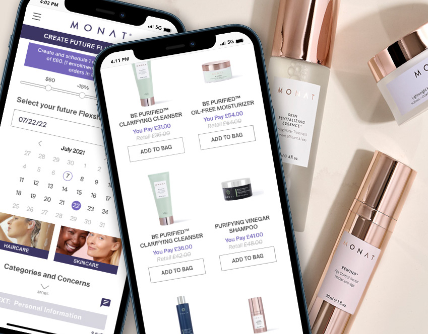
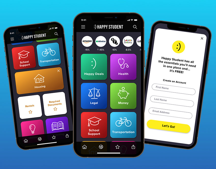
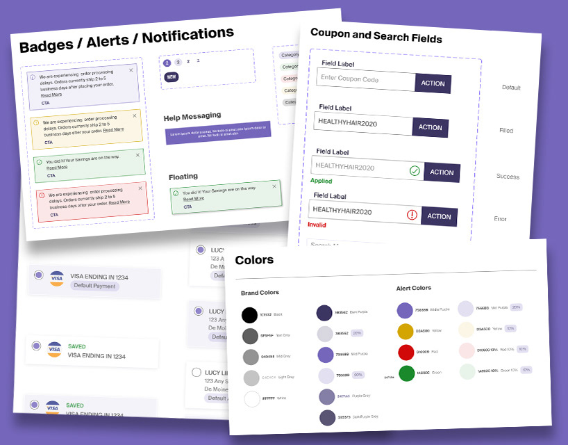
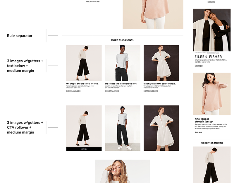
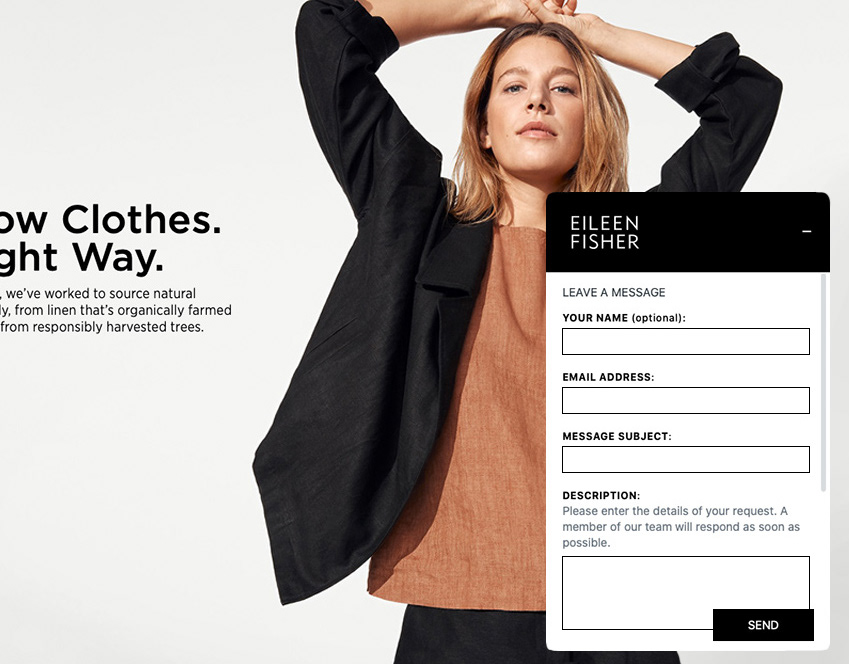
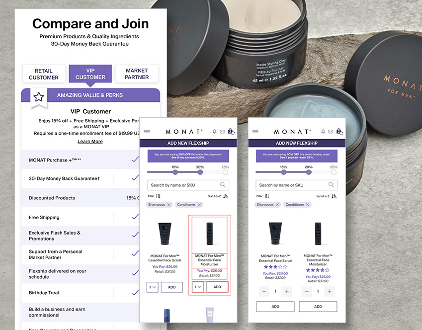
The challenge was to take the print catalog's static experience with its use of negative space, text on image, and linear user path and create a web version for the site that focuses on a dynamic online shopping experience.
The final digital catalog has a floating pop-up menu that follows the user down the page allowing the user to jump to a desired chapter. It also includes drop-down drawers to customize the viewing experience, enhanced functionality with sliders, ADA compliancy, greater shop-ability and video that brings it to life.
Landing Page is first shown with drawers open for an effortless shopping experience. The user has the option to close the drawer if they don't want to see that chapter.
Mobile layout with floating menu, video and product sliders :
