PRODUCT GRID EXPLORATION
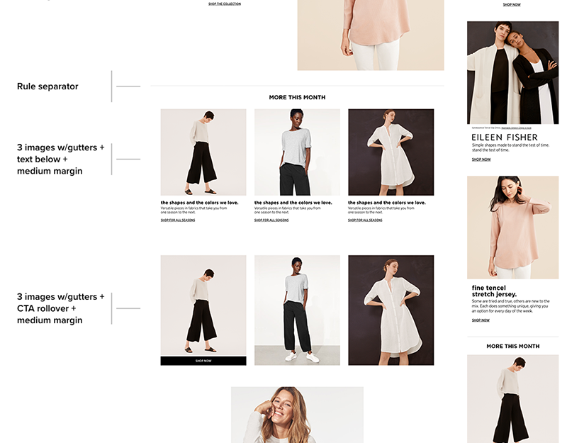
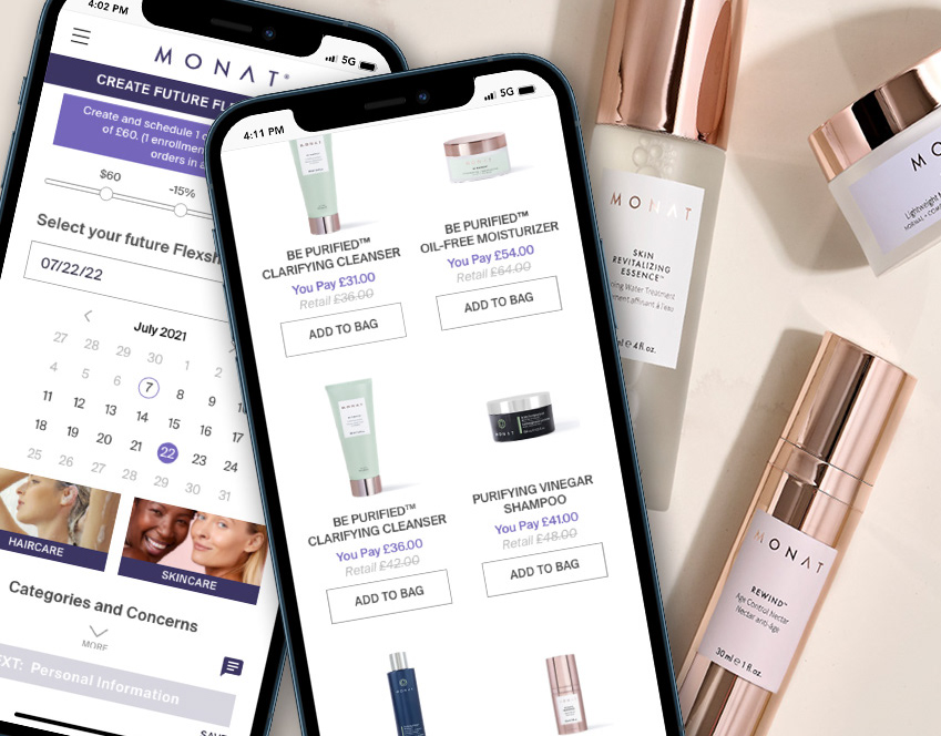
• Two options from product grid exploration. The task was to create a modular content block that could work on both desktop and mobile.
• Two options for quantity selectors, a drop-down and a button
•The module was designed to also contain customer ratings to be implemented at a later time.
•Above the product are chips that show what the user chose for filters.
PROGRAM OPTIONS FOR NEW CUSTOMERS
• With 3 ways to shop and no clear way to show the customer what the options and benefits are, a new solution was needed. Here is the final design.
•I used color and icons to show the different program types.
•The straight retail option was not encouraged, so it was subtly under-designed to draw attention to the other two options.
•Each option on the tabbed grid shows benefits clearly with no confusion.
PROGRAM OPTIONS FOR NEW CUSTOMERS - Desktop
THANK YOU PAGE
•Two options for the thank you page that is generated after a purchase
•On the left is a simple version with the order number, an email confirmation message, contact us and feedback links, and social links.
•On the right, I included a 'You May Also Like" section to promote more product to the consumer.
FLOW CHART
•Path to purchase for New Customers and Existing Customers with the choice to become a VIP or MP.
