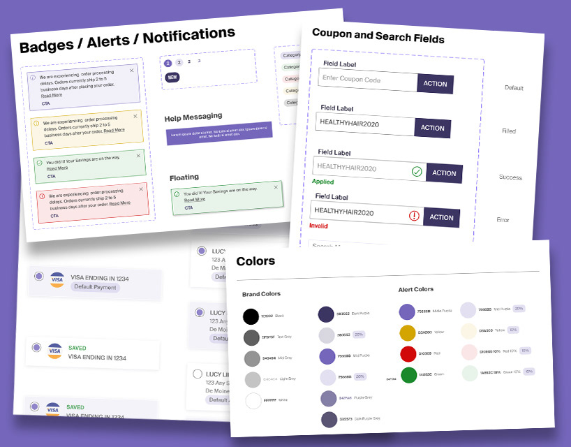
OVERVIEW:
Monat is a retail and multi-level marketing company specializing in haircare, skincare and wellness products that operates in 8 countries globally.
THE CHALLENGE:
The brand is well known for its quality beauty products, but the user experience for potential distributors left them frustrated by the confusing process. Too many options, too many words were used to convey basic information and an interface that didn't match up to the brand‘s esthetics and high quality.
The limitations of the site, especially on mobile, forced the Market Partners to create their own work-arounds to be more efficient when dealing with their customers.
CREATING CHANGE:
Updated user interface and improved user experience through design and interactive prototypes to create the change that Monat needed to move forward. Software used: Figma and Adobe XD.
USABILITY TESTING:
We conducted usability tests with current VIP and Market Partners presenting our proposed changes in prototypes. Their feedback showed that they were fervent about the brand and its products, but they felt that the experience wasn't current with what competitors offer from a user experience and technology view.
THE RESULT
An improved responsive website with a less frustrating mobile experience and a streamlined shop flow reducing the confusion and speeding up the purchase process.
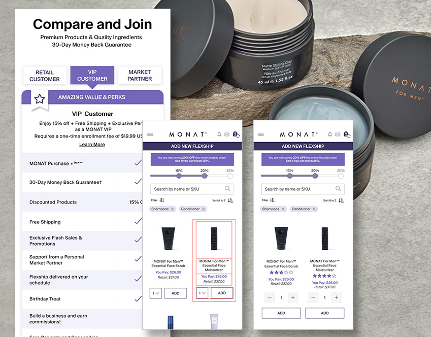
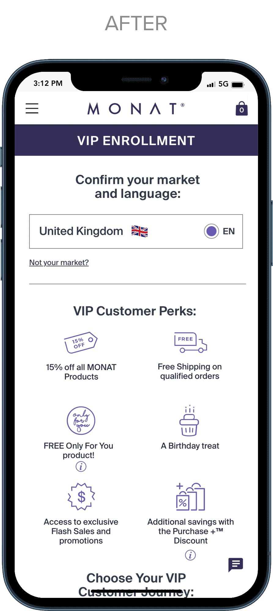
VIP ENROLLMENT FLOW: CHOOSING YOUR MARKET

Before:
•The mobile view had limited information on the program and the site used a jpeg which was impossible to read on mobile.
•There are five steps, and the user has no indication of where they are in the process.
•The country selector was generic and not matching the site branding.
After:
•Implemented a sticky header to keep the brand upfront.
•Created section headers to let the user know what step they are in.
•Improved country selector design using flags as visual clues.
•Expanded perk overview and VIP options with more details.
ENROLLMENT ORDER AND PRODUCT LISTING


Before:
•The shopping experience is delayed with process steps and market info.
•Header has no logo branding.
•Page styling is inconsistent.
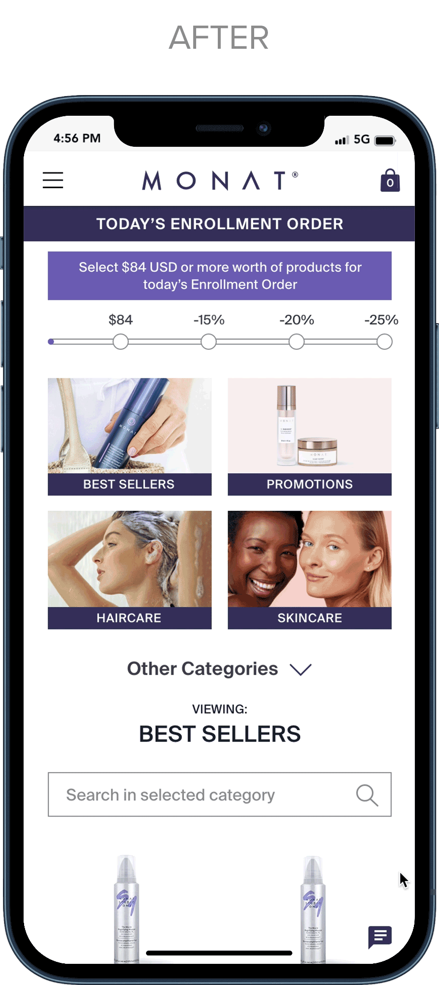
After:
• The main page has top shopping categories for easy searching and shopping.
• Added categories and concerns for finding shop categories.
•Enrollment process is shown in the footer and highlights when the user is ready for the next step in the enrollment.
•Header has the logo and the stage of the enrollment process clearly shown.


Before:
•The shopping experience is delayed with process steps and market info
•Header has no logo branding
•Product listing is not mobile optimized and only shows one and a half products at a time
•Page styling is inconsistent
After:
• The main page has top shopping categories for easy searching
• Added categories and concerns for finding shop categories
•Enrollment process is shown in the footer and highlights when the user is ready for the next step in the enrollment
•Header has logo and the stage in the enrollment process clearly shown
• Product grid redesigned to show more on mobile
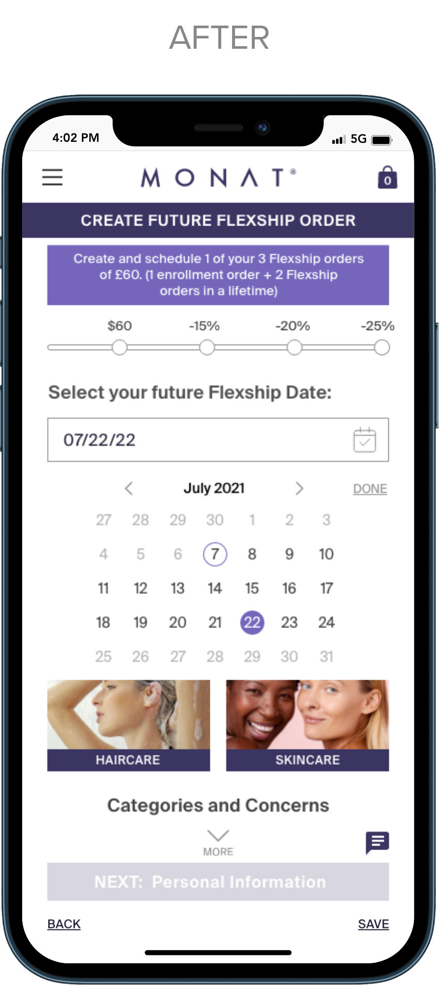
FLEXSHIP DATE PICKER
Before:
•Flexship date picker was far down the page
•Styling didn't match site colors and overall tone
After:
• Date picker is moved up at the beginning of the shopping experience
• new layout takes advantage of the horizontal space better
•Styling better matches tone of the brand
PERSONAL INFO AND CC
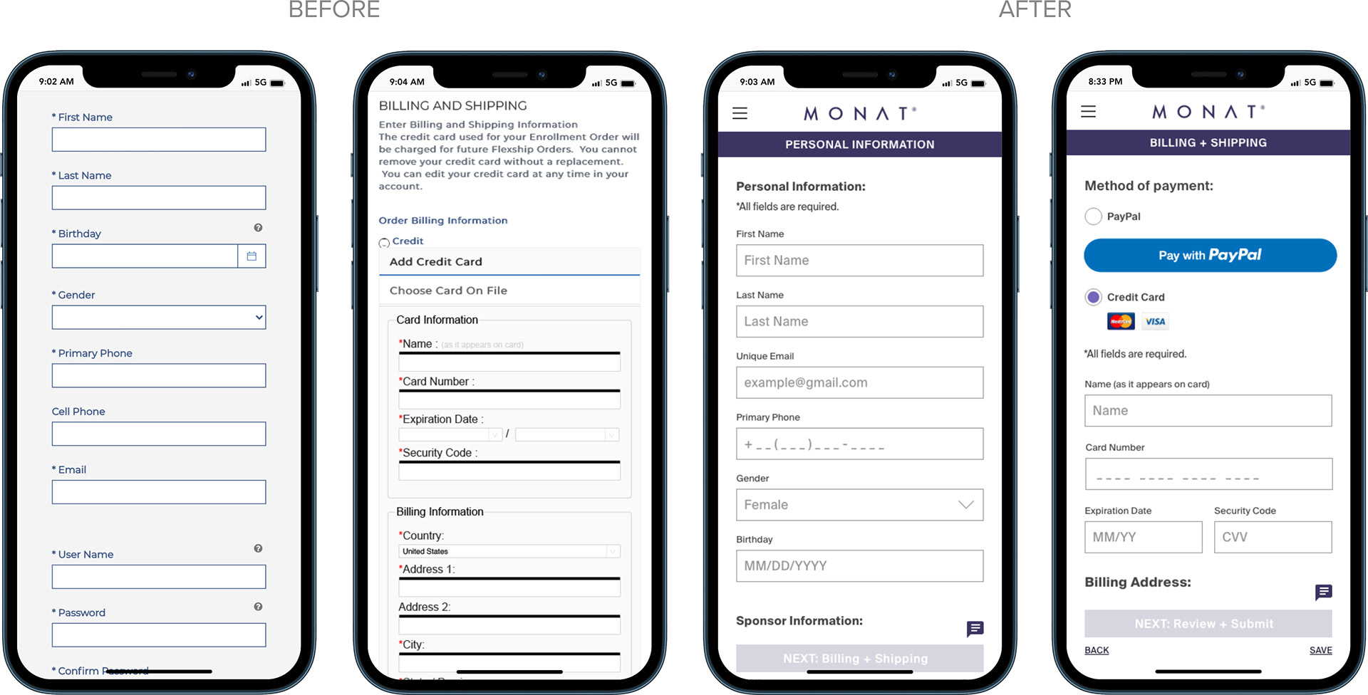
Before:
•Form fields are not ADA compliant for touch sizing
•Asterisks are blue on one form and red on another
•Asterisks on all fields is redundant.
•Overall styling is not elevated for the brand
After:
• Increased size of the touch area for ADA compliance
•Made payment method more prominent and added Paypal
•Added hints in form fields
•Removed asterisks on fields since all are required and replaced with one line at top
•Header with section name making it clear where the user is at all times
•Styling is elevated to match the brand
EMPTY CART
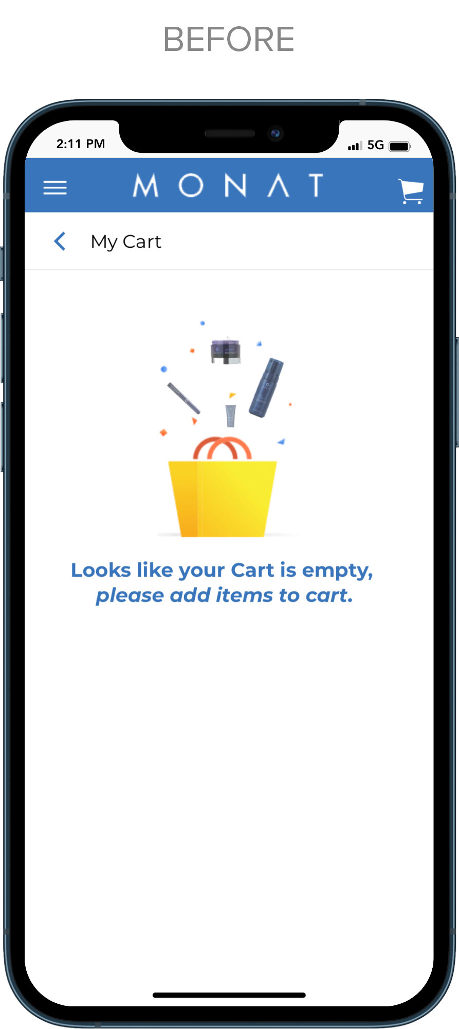
Before:
•Content does not match the tone of the brand
•There is no link to take the user back to shopping
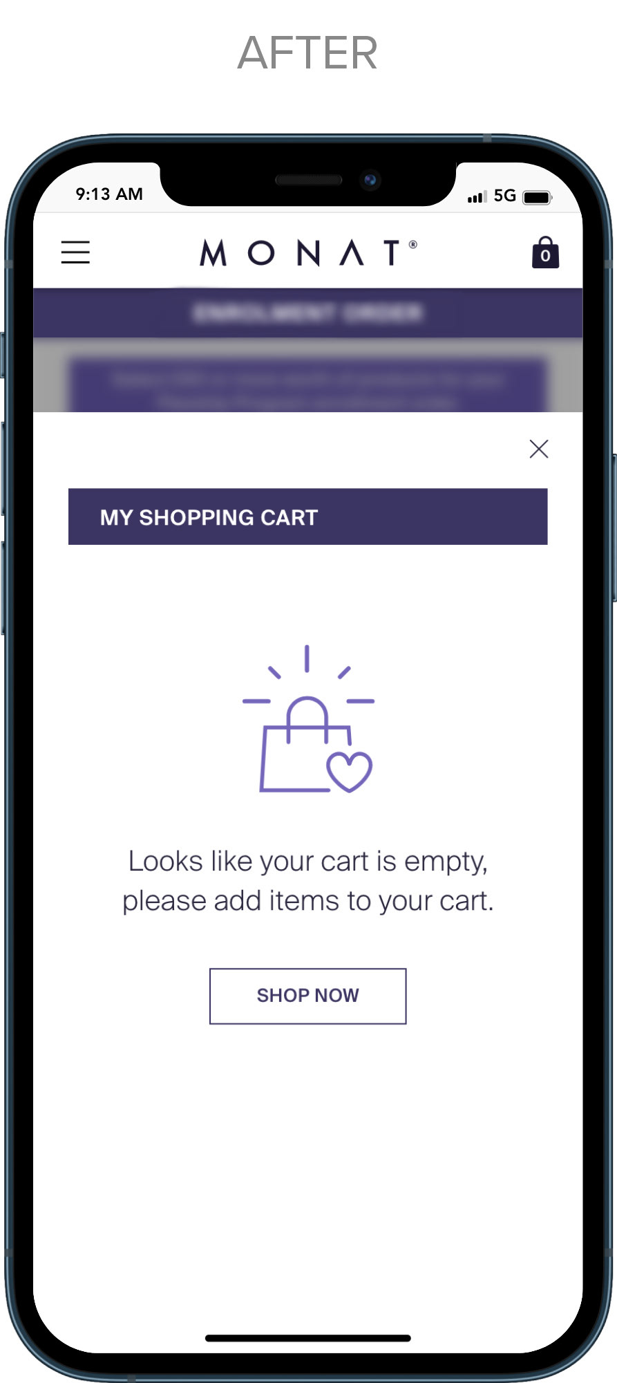
After:
•Styling is more consistent with the brand
•A link is added to take the user straight to shopping
PROGRESS BAR, SHOPPING BAG AND MESSAGING
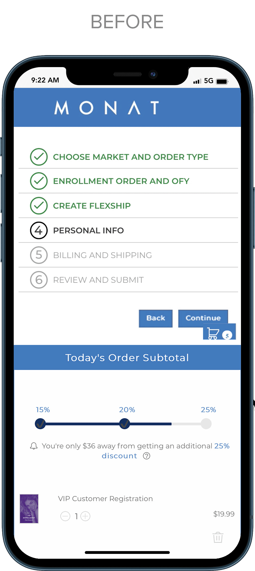
Before:
•Purchase Plus progress bar was hidden inside the cart, so the customer couldn‘t see how much more they had to purchase to save unless they clicked into the cart.
•Color of the progress bar was black which was not considered friendly or on brand.
•Progress bar was unclear with the percentage without the word "off" after it. There was no purchase limit for free shipping shown.
•A shopping cart icon was used which felt more right for big box stores than for beauty products.
•Messaging was in grey text and below bar making it too subtle to be effective at encouraging to shop.
After:
•Purchase Plus progress bar was placed above the shopping area to keep consumers updated on how far away they are from saving more.
•The color of the bar was changed to be more on brand and friendlier than the black used before.
•Progress bar was improved by adding -(minus) before the percent off and the purchase limit for free shipping is now shown.
•The cart icon was replaced with a bag icon for a more beauty-oriented experience.
•a gentle slide-down message in branded colors draws the user's attention to the shop message, encouraging continued shopping.
RESULTS:
Feedback from VIP and Market Partners was enthusiastic and they felt it was a move in the right direction for Monat. They felt it was updated and easier to use and understand for new customers and a more streamlined process for existing VIP and Market Partners.